RingUS
User experience
Ask yourself:
-
How many notifications before it becomes annoying?
-
Can users customize which apps trigger alerts?
-
Is there a “Do Not Disturb” mode?
Too many alerts = people stop wearing it.
Input / interaction
Right now your idea is one-way (phone → ring).
You could push it further:
-
Tap gestures on the ring to dismiss notifications
-
Double-tap to mark as read
-
Swipe-like gestures using touch sensors
Your interaction idea = very strong
This is where you’re thinking like a product designer:
-
Tap to dismiss ✅
-
Double tap = mark as read ✅
This is exactly how you differentiate from “just a notifier.”
A sharper version of your concept (2026 draft)
If I condensed your idea into a strong product direction:
A minimalist smart ring that delivers priority-only notifications through subtle light + haptic signals, with gesture control, designed to reduce screen dependence—not increase it.
That positioning matters a lot.
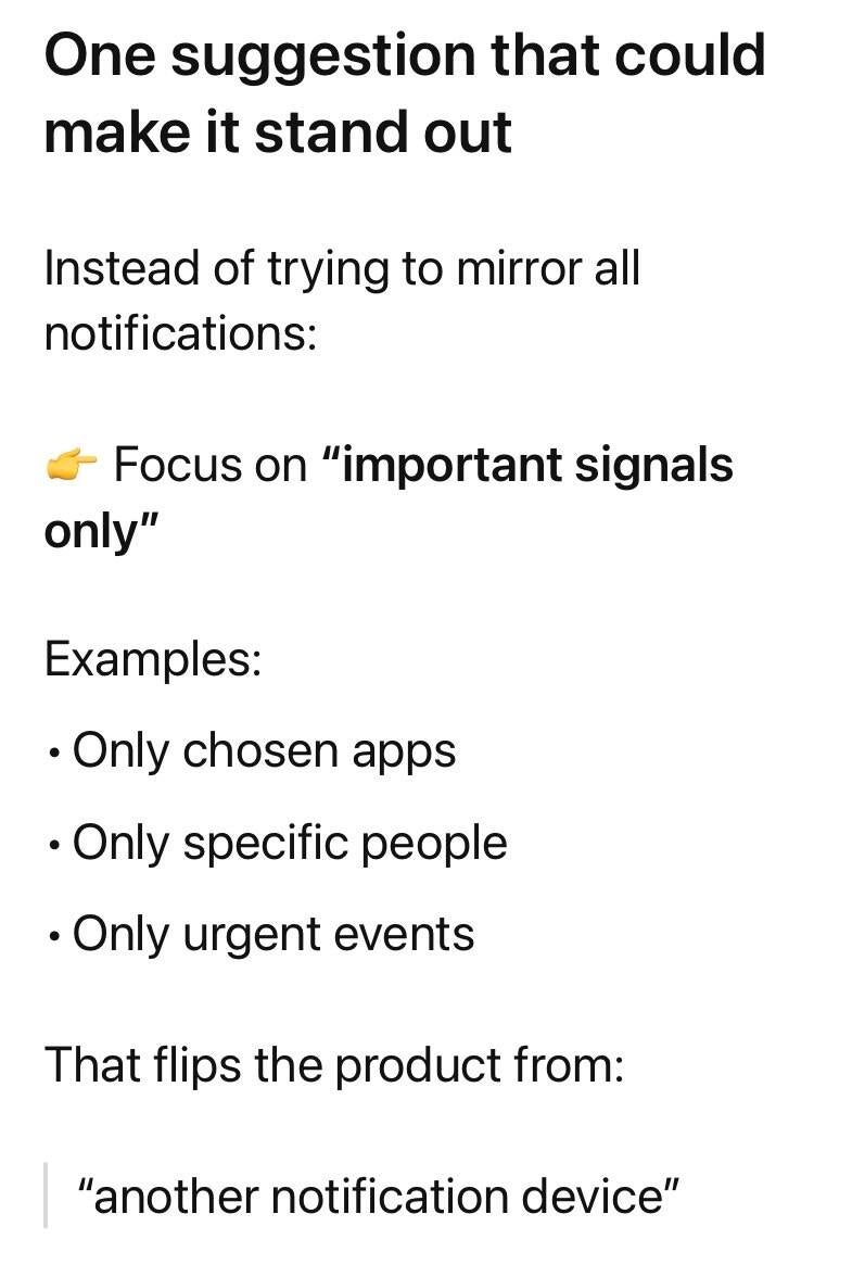
One suggestion that could make it stand out
Instead of trying to mirror all notifications:
👉 Focus on “important signals only”
Examples:
-
Only chosen apps
-
Only specific people
-
Only urgent events
Feature ideas worth exploring
-
Priority tiers via vibration patterns
-
Short buzz = low priority
-
Strong pulse = urgent
-
-
Color-coded light system
-
Red = urgent
-
Blue = social
-
Green = work
-
-
Gesture shortcuts
-
Tap = dismiss
-
Double tap = mark read
-
Hold = send quick auto-response
-
-
-
In a meeting → suppress everything except VIP contacts
-
Driving → only calls
Context awareness
-